
 Agathe Cocco
This is the second part in a three-part series about CSS illustrations and animations. In this part, we will build a CSS Polaroid and then learn how to animate it.
Part 1: Learning basics and workflow tips with a CSS Smiley Face
Part 2: Intro to CSS animations with a CSS Polaroid
Part 3: More advanced techniques with a CSS Lighthouse Scene
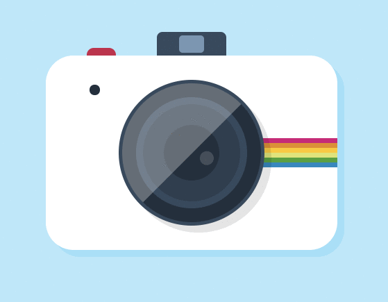
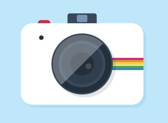
Here's what we're going to build:

If you want to have a go at building this yourself, pause here. There’s nothing in here that we haven’t already seen in the previous part. Don't worry too much about exact colors and sizes, and remember that there are often multiple ways to achieve the same result.
Okay let’s do this. Let’s take a close look at this image and decompose it. It is made of fairly simple shapes, mostly rounded rectangles and circles, and we can easily recreate them with basic CSS. Let’s see what the basic HTML tree looks like:
.polaroid
  .button
  .flash
  .polaroid-body
  .blinker
  .zoom
  .stripes
The .polaroid element acts as our main container and will serve as a reference for the positioning of all other elements.
Let's get started by setting a few basic properties to our html and body selectors, as well as a few color variables:
$background: #b5e8fb;
$grey: #34495e;
$dark-grey: #212f3d;

html, body {
  height: 100%;
  width: 100%;
  padding:0;
  margin:0;
  overflow: hidden;
}
html {
  box-sizing: border-box;
}
*, *:before, *:after {
  box-sizing: inherit;
}
body {
  background: $background;
}
All elements in our illustration need to have an absolute position, and so do all of the :before and :after pseudo-selectors.
* {
  position: absolute;
}
*:before, *:after {
  content: "";
  position: absolute;
}
Let's center the main container vertically and horizontally on the page, and assign it a width and a height.
.polaroid {
  width: 420px;
  height: 280px;
  top: 50%;
  left: 50%;
  transform: translate(-50%, -50%);
 }
Now that our environment is set up, we can start working on the different shapes of the polaroid. First, we need a .polaroid-body element that will represent the body of the camera. We can use SASS's darken function to generate a shade that matches the background for the shadow. It gives a softer look than using plain black.
.polaroid-body {
  width: 100%;
  height: 100%;
  border-radius: 40px;
  background-color: #fff;
  box-shadow: 10px 10px darken($background, 5%);
}
The button is straightforward. We want to place it behind the body of the polaroid, and the natural flow of the HTML will take care of this for us.
.button {
  width: 10%;
  height: 5%;
  top: -2%;
  left: 14%;
  background-color: #cb214a;
  border-radius: 16px;
}

Since we need two selectors for the flash, we can use :after:
 .flash {
   width: 24%;
   height: 15%;
   top: -12%;
   left: 38%;
   background-color: $grey;
   border-radius: 8px;
   &:after {
     width: 36%;
     height: 60%;
     background-color: lighten($grey, 30%);
     border-radius: 5px;
     top: 10%;
     left: 32%;
   }
}

The blinker is pretty simple too:
.blinker {
  width: 15px;
  height: 15px;
  border-radius: 15px;
  background-color: $dark-grey;
  top: 15%;
  left: 15%;
}

Let's move on to the zoom:
.zoom {
  width: 50%;
  height: 75%;
  left: 25%;
  top: 12.5%;
  background: $dark-grey;
  border-radius: 50%;
  border: 5px solid $grey;
  box-shadow: 10px 10px rgba(0, 0, 0, 0.1);
  overflow: hidden;
  &:before {
    width: 80%;
    height: 80%;
    top: 10%;
    left: 10%;
    border-radius: 50%;
    background: #2c3e50;
    border: 10px solid $grey;
  }
  &:after {
    width: 40%;
    height: 40%;
    top: 30%;
    left: 30%;
    border-radius: 50%;
    background: $dark-grey;
  }
}
Using a combination of pseudo-selectors and borders, we recreated the different parts of a zoom with only one div. Sweet!

Now, I want to add a few more details to our zoom, but we've run out of pseudo-selectors. Let's add one div to our HTML:
.polaroid
  .button
  .flash
  .polaroid-body
  .blinker
  .stripes
  .zoom
    .reflections
.reflections {
  background-color: #fff;
  opacity: 0.3;
  width: 100%;
  height: 100%;
  left: -35%;
  top: -35%;
  z-index: 99;
  transform: rotate(-45deg);
  &:after {
    background-color: #fff;
    width: 20px;
    height: 20px;
    border-radius: 50%;
    left: 50%;
    top: 105%;
    opacity: 0.5;
  }
}
The main reflection is made with a square rotated by 45 degrees. I've added the property overflow:hidden to the zoom element to only reveal the part of the reflection that overlaps with the it. With the :after pseudo-selector, I have added another small light reflection.

Our polaroid is almost done. We need to add a last detail: the rainbow stripes so representative of the brand. There are different ways to achieve this. The simplest way would be to create five divs, and assign a different background color to each. We could also have a combination of pseudo-selectors and borders, like we did with our zoom. Another option would be to apply a gradient with color stops. Instead, we're going to use the box-shadow property and chain multiple values
.stripes {
  height: 7px;
  width: 50%;
  right: 0;
  top: 40%;
  box-shadow: 0px 7px rgb(214, 0, 121), 0px 14px rgb(230, 141, 21),
              0px 21px rgb(254, 200, 3), 0px 28px rgb(221, 229, 107),
          0px 35px rgb(62, 162, 48), 0px 42px rgb(1, 136, 194);
}
Again, this goes to show there are often multiple ways to achieve the same result. There's no right or wrong way to do it, and it all comes down to your own preferences. I like to keep my code as DRY as possible so I will often opt for the method that requires the least amount of code.
And we're done with our Polaroid!

CSS Animations
Now on to my favourite part: animating the illustration!
There are different ways to create animations in web development, almost all of which can be used to animate CSS images. However, in the spirit of the theme of this series, we will of course use CSS animations.
Animations basics
CSS animations are achieved in two steps.
Suppose you want to create an animation where you rotate a square.
You will first need a @keyframes rule:
@keyframes rotation {
  0% {
    transform: rotate(0deg)
  }
  100% {
    transform: rotate(360deg)
  }
}
This rule is composed of two keyframe selectors, 0% and 100%, inside of which we can add CSS properties. These properties will control the appearance of our square at that point in the animation.
In the example above, the square will rotate from 0 to 360 degrees.
There are only two keyframe selectors defined in this rule, but we can add as many as we like. Suppose we don't want our square to make a full rotation, but instead
rotate to 180 degrees, then rotate back to 0. It can be achieved with an extra keyframe selector:
@keyframes rotation {
  0% {
    transform: rotate(0deg)
  }
  50% {
    transform: rotate(180deg)
  }
  100% {
    transform: rotate(0deg)
  }
}
Any point between two keyframe selectors represent the transitioning state from one selector to another. For example, assuming the animation is linear, at 25% the square will have rotated by 90 degrees.
The second step is to call this rule in a selector with the animation property:
.square {
  animation-name: rotation;
  animation-duration: 5s;
  animation-timing-function: linear;
  animation-iteration-count: infinite;
}
Or with a shortcut:
.square {
  animation: rotation 5s linear infinite;
}
These animation sub-properties allow us to call our @keyframes rule and set parameters such as duration, easing, delay etc. Most of them are optional but we must specify a name and a duration. Read more about them here.
Although we won't use them in this tutorial, real life CSS animation declarations and
@keyframesrules both require vendor prefixes to work across all modern browsers:
.square {
  -webkit-animation: rotation 5s linear infinite;
  -moz-animation:    rotation 5s linear infinite;
  -o-animation:      rotation 5s linear infinite;
  animation:         rotation 5s linear infinite;
}
-webkit-@keyframes rotation {
  0% {
    transform: rotate(0deg)
  }
  100% {
    transform: rotate(360deg)
  }
}

-moz-@keyframes rotation {
  0% {
    transform: rotate(0deg)
  }
  100% {
    transform: rotate(360deg)
  }
}

-o-@keyframes rotation {
  0% {
    transform: rotate(0deg)
  }
  100% {
    transform: rotate(360deg)
  }
}

@keyframes rotation {
  0% {
    transform: rotate(0deg)
  }
  100% {
    transform: rotate(360deg)
  }
}
Animating our CSS Polaroid
Now that we've got the basics down, let's animate our CSS Polaroid. I would like to create a sequence of animations in which first the button is pressed, then the blinker blinks, then the zoom rotates, and lastly the flash goes off. Then the animation will repeat infinitely.
Usually, creating sequences with CSS keyframes isn't recommended as there is no easy way to chain multiple separate animations. Instead, you have to time each of them just right so they are each triggered at the right time. This can quickly become a pain if the animation is complex, but this one is simple enough and I think it'll be good practice! Let's get started.
First, we are missing an element: the flashlight. Let's add it quickly:
.polaroid
  .button
  .flash
  .polaroid-body
  .blinker
  .stripes
  .zoom
    .reflections
.flashlight
.flashlight {
  position: fixed;
  width: 100%;
  height: 100%;
  top: 0;
  left: 0;
  background: rgba(white, 0.7);
  transition: all ease 0.2s;
  opacity: 0;
}
I've broken the rule and placed the flashlight element outside of our main container. This is because I want it to take the full width and height of the screen. I've also set its opacity to 0 as we don't want it to be visible for now.
The first animation will be the press on the button. It needs to move down, then back up to its original position like so:
@keyframes button {
  0% {
    transform: translateY(0);
  }
  50% {
    transform: translateY(10px);
  }
  100% {
    transform: translateY(0);
  }
}
Then we can call this rule in the .button selector:
.button {
  //...
  animation: button 5s linear infinite;
}

This doesn't look quite right, the animation is way too slow. We've set the duration of the animation to 5s, but this supposed to be the length of the whole sequence, with all four animations. We need to shorten the length of this one. Let's have it run from 5% to 15%.
@keyframes button {
  0% {
    transform: translateY(0);
  }
  5% {
    transform: translateY(0);
  }
  10% {
    transform: translateY(10px);
  }
  15% {
    transform: translateY(0);
  }
  100% {
    transform: translateY(0);
  }
}
We can take a shortcut and write it like this:
@keyframes button {
  0%, 5%, 15%, 100% {
    transform: translateY(0);
  }
  10% {
    transform: translateY(10px);
  }
}
Lastly, if we look closely at the timeline, we see that the button is not being animated between 0% and 5%, or between 15% and 100%. The animation only runs from 5% to 15%, and at any other point in the 5s timeline, it's at its original, untransformed state: (translateY(0)).
Hence the start and end keyframe selectors are not needed:
@keyframes button {
  5%, 15%{
    transform: translateY(0);
  }
  10% {
    transform: translateY(10px);
  }
}
I said 'original state' above because the .button element hasn't been attributed a transform property to begin with. If for example we had this:
.button {
  transform: translateY(-20px);
}
then the above shortcut wouldn't work, because from 15% to 100% the button would be transitioning back to that position.

Now let's move on to the second animation, the zoom rotation. Let's have it start at 20%, rotate by 20 degrees for 6% of the total duration, then rotate back to its initial position for another 6%.
@keyframes zoom {
  20%, 32%  {
    transform: rotate(0deg);
  }
  26% {
    transform: rotate(20deg);
  }
}

.zoom {
  //...
  animation: zoom 5s linear infinite;
}
Cool. Now let's animate the blinker. We're going to animate the background color to make it flash red three times.
@keyframes blinker {
  33%, 37%, 39%, 43%, 45%, 50% {
    background-color: $dark-grey;
  }
  34%, 36%, 40%, 42%, 46%, 48% {
    background-color: $red
  }
}

.blinker {
  //...
  animation: blinker 5s linear infinite;
}
It's starting at 33%, then transitioning to a red background for 1% of the total duration, then pausing for 2%, then transitioning back to grey for 1%. And it's repeating this sequence 2 more times.
You can see how the possibility to chain or loop independent animations would be useful in this case. It would be nice to be able to define one blink animation, then set it to repeat twice, instead of having to define so many keyframe selectors. Alas, CSS doesn't offer this option, so we must resort to this kind of calculation to get the effect we want.
And last, the flash animation:
@keyframes flashlight {
  55%, 65% {
    opacity: 0;
  }
  56% {
    opacity: 1;
  }
}

.flash-light {
  //...
  animation: flashlight 5s linear infinite;
}

Our animation can stop here. Nothing will happen between 65% and 100%: this will create a nice pause before the animation restarts.
One last thing we can do is store the duration of the animation into a variable:
$duration: 5s;

.button {
  //...
  animation: button $duration linear infinite;
}
.zoom {
  //...
  animation: zoom $duration linear infinite;
}
.blinker {
  //...
  animation: blinker $duration linear infinite;
}
.flash-light {
  //...
  animation: flash-light $duration linear infinite;
}
This will make it really easy to change the speed of the animation if we decide to.
Here's the final project in CodePen.
By now you should have a good understanding of how to create pure CSS images. Let's practice all these concepts one last time. In the third and last part of this series, we'll look at some new techniques to build an animated lighthouse scene.
Part 3: More advanced techniques with a CSS Lighthouse Scene


