 Sebastián Aliaga
This guide will take you through a step-by-step process of creating, coding, and configuring your first rendering/component within Sitecore XM Cloud using Next.js. Our focus will be on implementing a straightforward component with three fields and a placeholder.
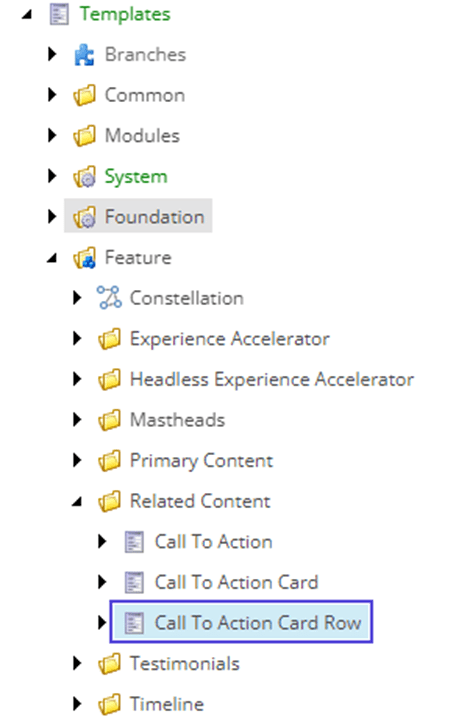
Folder Structure
To create your first rendering, it is essential to grasp the folder structure. Sitecore, by default, considers every component within the 'Components' directory, mapping and preparing them for rendering content when needed. For this example, let's craft a 'CallToActionCardRow' component situated in the 'Related Content' directory. Consequently, the folder structure will appear as follows:
Pro Tip: Enhance reusability by separating the type (model) from the component.

Creating the corresponding type/model
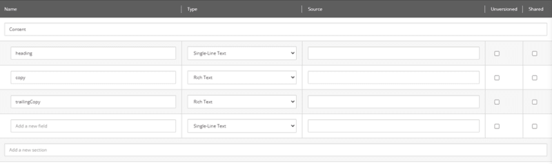
The initial step in creating the component is to establish the type. In this case, the component is simple, featuring only three fields. The type is defined as follows:

We will only have three fields: heading, copy and a trailing copy.
Creating the component
This is the end product, and now I'll break down what's going on inside the component.

First, we bring in the data types we need, including our custom type from earlier. Then, we set up the props type and the component type itself. Since we're using TypeScript, nailing down the correct types is crucial for both props and the component function.
Inside the component, it's pretty straightforward – we use JSX to structure our component the way we want. With Sitecore components, we can define our fields more effectively. For instance, we use 'Text' for the heading and 'RichText' for our copy field.
To create a Placeholder, we incorporate the Placeholder component and give it a name (which has to match the one in the CMS). Lastly, we create the default export for the component using the 'withDatasourceCheck' function, and we're all set to configure things in the CMS.
Inside the CMS
Templates
To set up the template, create an item under 'Template' in the content tree:
Next, establish the corresponding fields, ensuring the use of camelCase syntax, mirroring the TypeScript type.
Placeholder Settings
Proceed to create our placeholder settings under Layout/Placeholder Settings:

Make sure you set up the PlaceholderKey—it should match the one in the component. Also, list the allowed controls or renderings that can go inside this specific placeholder.

Rendering
To wrap up, navigate to Layout/Renderings and craft your rendering. It's crucial to use the Json Rendering template.

Configure the 'Component Name' field; it must match the one specified in your Next.js project.

As we're implementing a placeholder, scroll down to Layout Service and choose the corresponding placeholder.

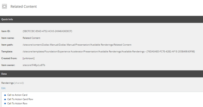
Add the rendering to the Available Renderings
To complete the setup and make it usable, the final step is to place it under Site/Presentation/Available Renderings. In this case, create an 'Available Renderings' item.

Inside of it, configure the corresponding rendering
Test the component
With this setup, navigate to the Pages editor and find, under Components, the Available Renderings we configured, including our newly created rendering.

As we didn't configure any standard values, messages will appear indicating that our fields lack text. However, you can still observe our heading, copy, trailing copy, and, of course, our placeholder.


