 Mads Stoumann
Why do some color-combinations look better than others? Spoiler: it involves math.
The other day, I wrote about the Color Theme Tool on my new website.
This tool, along with some other color-tools, I'll introduce in this post, are all based on the HSL color-format.
HSL stands for Hue Saturation and Lightness.
Hue is the main color — in degrees.
If you look at the color-wheel, it's a series of colors, in 30° intervals:
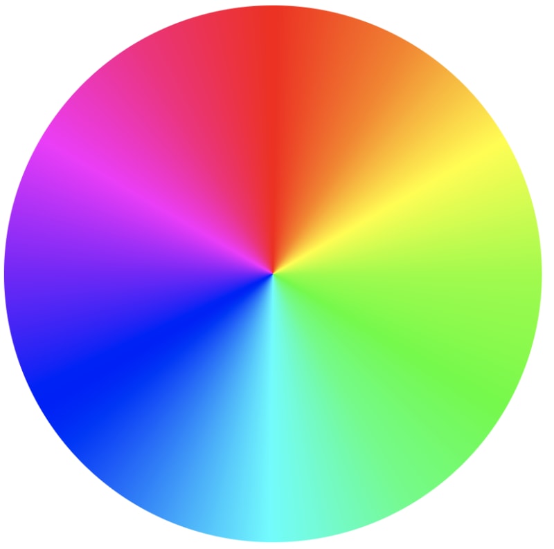
In CSS, it's:
.wheel {
  background: conic-gradient(
    hsl(0, 100%, 50%),
    hsl(30, 100%, 50%),
    hsl(60, 100%, 50%),
    hsl(90, 100%, 50%),
    hsl(120, 100%, 50%),
    hsl(150, 100%, 50%),
    hsl(180, 100%, 50%),
    hsl(210, 100%, 50%),
    hsl(240, 100%, 50%),
    hsl(270, 100%, 50%),
    hsl(300, 100%, 50%),
    hsl(330, 100%, 50%),
    hsl(360, 100%, 50%)
  );
  border-radius: 50%;
}
To turn it into a horizontal or vertical slider, change the gradient-type to linear-gradient:

Matching Colors
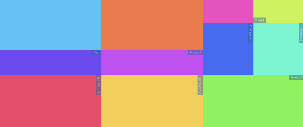
When colors look great together, it's all down to how they relate to eachother in the color-circle.
When you've selected a color (which we'll call the primary color), the color directly opposite that color (180° degrees), is called the complimentary color – and these two colors always look great together.
Let's split our HSL up into 3 CSS Custom Properties:
--h, --s and --l.
– and look at how we can use simple math to calc colors, that match our primary color:
.primary {
  hsl(var(--h), var(--s), var(--l));
}
The complimentary color adds 180° to --h:
.complimentary {
  hsl(calc(var(--h) + 180), var(--s), var(--l));
}
The Split Complimentary colors are 150° and 210° from the primary color:
.splitcom1 {
  hsl(calc(var(--h) + 150), var(--s), var(--l));
}
.splitcom1 {
  hsl(calc(var(--h) + 210), var(--s), var(--l));
}
Analogous colors are the colors next to the selected color (both sides) – in this case our primary color:
.analogous1 {
  hsl(calc(var(--h) + 30), var(--s), var(--l));
}
.analogous2 {
  hsl(calc(var(--h) - 30), var(--s), var(--l));
}
Triadic colors are evenly spaced around the color wheel, so from our primary color, its 120° and 240° (or: minus 120°):
.triad1 {
  hsl(calc(var(--h) + 120), var(--s), var(--l));
}
.triad2 {
  hsl(calc(var(--h) - 120), var(--s), var(--l));
}
The Square Colors consist of our primary color, and colors at 90°, 180° (complimentary) and 270°:
.square1 {
  hsl(calc(var(--h) + 90), var(--s), var(--l));
}
.square2 {
  hsl(calc(var(--h) + 270), var(--s), var(--l));
}
The Tetradic Rectangle is similar to the square, and consists of colors at 60°, 180° (complimentary) and 240°:
.tetra1 {
  hsl(calc(var(--h) + 60), var(--s), var(--l));
}
.tetra2 {
  hsl(calc(var(--h) + 240), var(--s), var(--l));
}
Tints
Tints add light to the --l – lightness:
.tint10 {
  hsl(var(--h), var(--s), calc(var(--l) + ((100% - var(--l)) / 10) * 1));}
.tint20 {
  hsl(var(--h), var(--s), calc(var(--l) + ((100% - var(--l)) / 10) * 2));
}
/* etc. */
Shades
Shades removes light from the --l – lightness:
.shade10 {
  hsl(var(--h), var(--s), calc(var(--l) - ((100% - var(--l)) / 10) * 1));
}
.shade20 {
  --c-sh2: hsl(var(--h), var(--s), calc(var(--l) - ((100% - var(--l)) / 10) * 2));
}
/* etc. */
All these CSS calculated -colors, are what I'm using in my CSS Color Theme Tool, based on the --h, --s and --l properties:

Now, let's look at how to build a Color Picker.
HSL Color Picker
All it takes to create a simple, HSL-based Color Picker, is three <input type="range">-controls, one for each of the CSS Custom Properties: --h, --s and --l:
<form id="hsl">
  <input type="range" name="--h" min="0" max="360" value="0" />
  <input type="range" name="--s" min="0" max="100" value="100" data-suffix="%" />
  <input type="range" name="--l" min="0" max="100" value="50" data-suffix="%" />
  <div class="hsl"></div>
</form>
In CSS, style the sliders as you want, and assign the calculated HSL-color to the color preview, the <div class="hsl">:
.hsl {
  aspect-ratio: 1/1;
  background-color: hsl(var(--h,0), var(--s,100%), var(--l, 50%));
  width: 20rem;
}
Finally, in JavaScript, add a single eventListener on the form, that'll update the CSS Custom Properties:
hsl.addEventListener('input', (event) => {
  const input = event.target;
document.documentElement.style.setProperty(input.name, `${input.valueAsNumber}${input.dataset.suffix||''}`)
})
And that's it! I used this method (and a bit more JavaScript), to create these small color pickers:
A bit more complex, this Color Tool also use HSL-based sliders, and JavaScript to convert between the various formats (rgb, cmyk, hex):

It also features a gradient-editor, for all types of CSS gradients: conic, linear and radial:
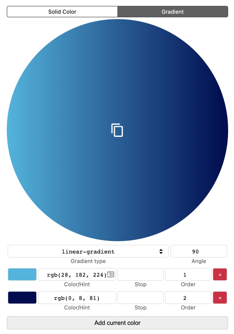
You can find the tool on Codepen:
Bonus: HSB Color Picker
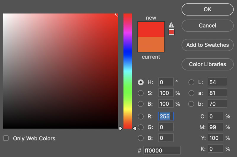
The main area in Photoshop's Color Picker, is made of three layers, and is way easier to understand, if you look at the HSB-format.
The B is for Brightness, and use a slightly different algorithm than the Lightness of HSL.
If you look at the HSB-area as a coordinate-system, Saturation is the x-axis (left-ro-right, 0 to 100) and Brightness is the y-axis (bottom-to-top, 0 to 100).
Thus, the top-right position is 100, 100 and the bottom-left 0, 0.
To re-create this in HTML and CSS, use three layers:
<div class="hue">
  <div class="brightness"></div>
  <div class="saturation"></div>
</div>
.hue {
  --h: 0;
  background-color: hsl(var(--h), 100%, 50%);
}

.saturation {
  background-image: linear-gradient(to bottom, transparent, hsl(var(--h), 0%, 0%));
}

.brightness {
  background-image: linear-gradient(to right, hsl(var(--h), 100%, 100%), transparent);
}
The .saturation and .brightness-layers need to be positioned absolute, relative to the hue-layer.
The CSS does not reflect the actual saturation and brightness, but layered like this, the illusion is complete:

Try changing the value of --h.
If you want to build a Photoshop-like color-picker in JavaScript, detect the x and y-position of the pointer-device, use getBoundingClientRect() to get the dimensions of the »picker area«, and convert it, so you'll always get a coordinate between 0,0 and 100,100.
Again: x equals Saturation and y equals Brightness.
You'll also have to convert HSB to HSL(with JavaScript), as browsers don't understand the HSB-format.
So ... I think HSL-based color-pickers are easier to both code and use!
Thanks for reading!