 Mads Stoumann
Summer Holidays are meant to be relaxing, so I typically read a lot of books. This year, one of the titles I read, was Making and breaking the grid by Timothy Samara. A great and super-inspiring book.
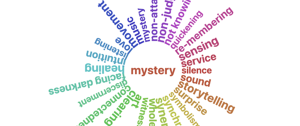
In fact, a bit too inspiring! The book is filled with gems. So ... when I see something like this:

— I can't help myself. I just have to code it!
It's not super-complex. You take an array of words:
const arr = 'word word word etc'.split(' ')
Then you output it as whatever tag you want, in my case <strong>. For each entry, set a custom property with the current index:
arr.map((txt, index) => `
<strong style="--d:${index};">
  ${txt}
</strong>`).join('')
On the parent-element, set a custom property with the length of the array:
app.style.setProperty('--ln', arr.length);
NOTE: You don't need JavaScript for the word-wheel. It's perfecty fine to manually write a bunch of tags (see Codepen-example later).
In CSS, set the parent-element to position:relative, and all the children to:
strong {
  inline-size: var(--c);
  inset-block-start: 50%;
  inset-inline-start: 50%;
  padding-inline-start: var(--c);
  position: absolute;
  translate: -50% -50%;
}
--c is the size of the circle.
We'll use rotate (now available as an individual transform in all browsers!) and our custom properties:
calc(var(--d) * 1deg * (360 / var(--ln)));
UPDATE: Since some people have issues with individual transforms, I've changed them to a "classic" combined value:
transform: translate(-50%, -50%) rotate(calc(var(--d) * 1deg * (360 / var(--ln, 1))));
And that's it. I expanded the example with a dynamic hue, font-size and more. Play around with the controls in this Codepen (best viewed in full screen):


